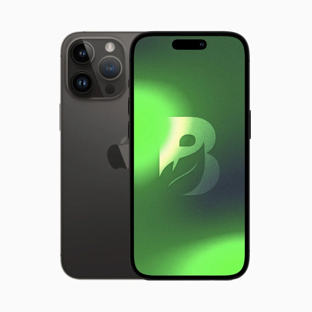

iPhone 13 Pro Max 256GB – Grafito
El precio original era: $1.000.000.$500.000El precio actual es: $500.000.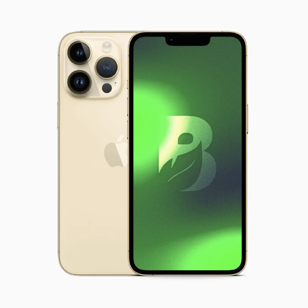
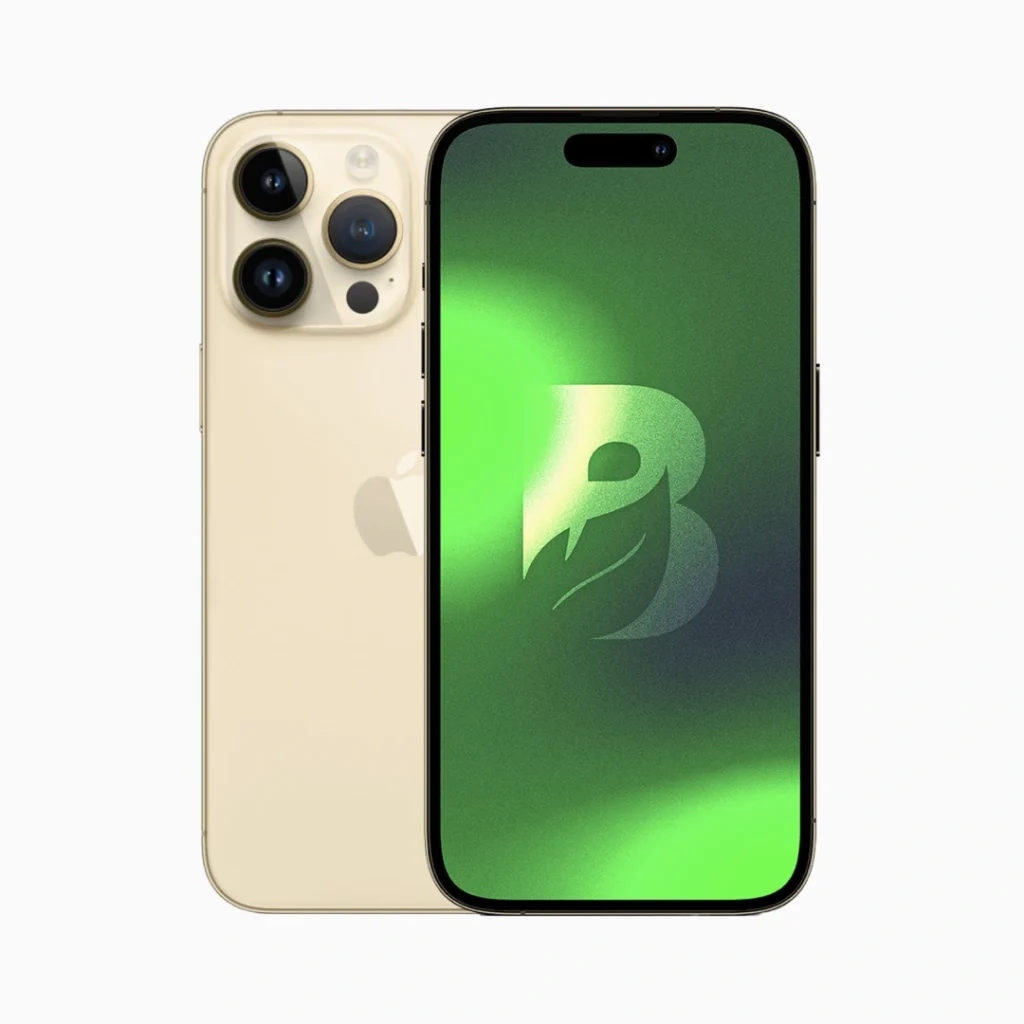
iPhone 13 Pro Max 256GB – Oro
El precio original era: $1.000.000.$500.000El precio actual es: $500.000.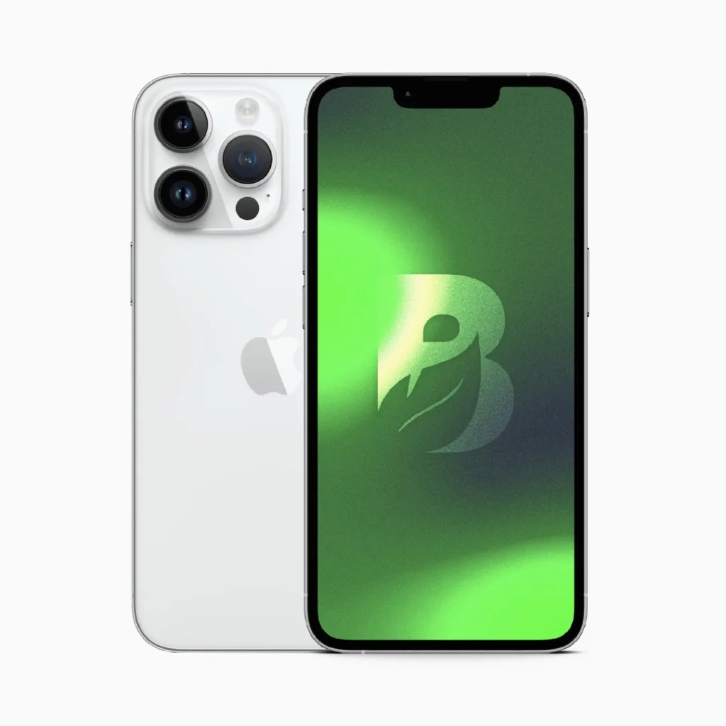
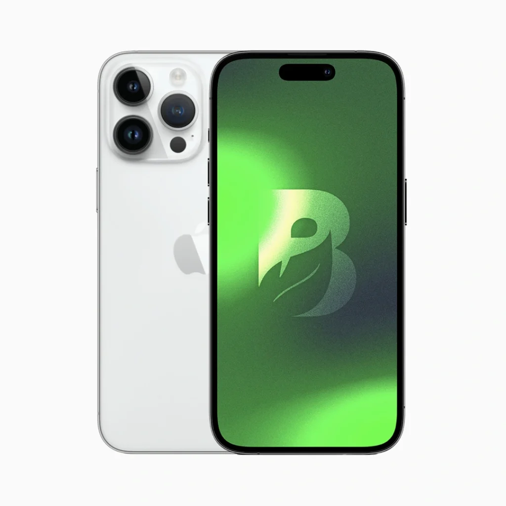
iPhone 13 Pro Max 256GB – Plata
El precio original era: $1.000.000.$500.000El precio actual es: $500.000.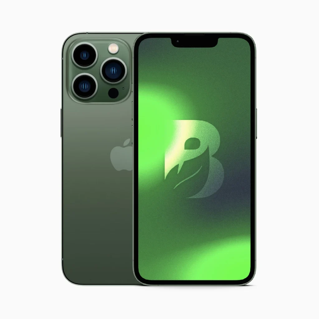
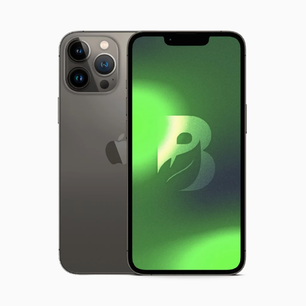
iPhone 13 Pro Max 256GB – Verde Alpino
El precio original era: $1.000.000.$500.000El precio actual es: $500.000.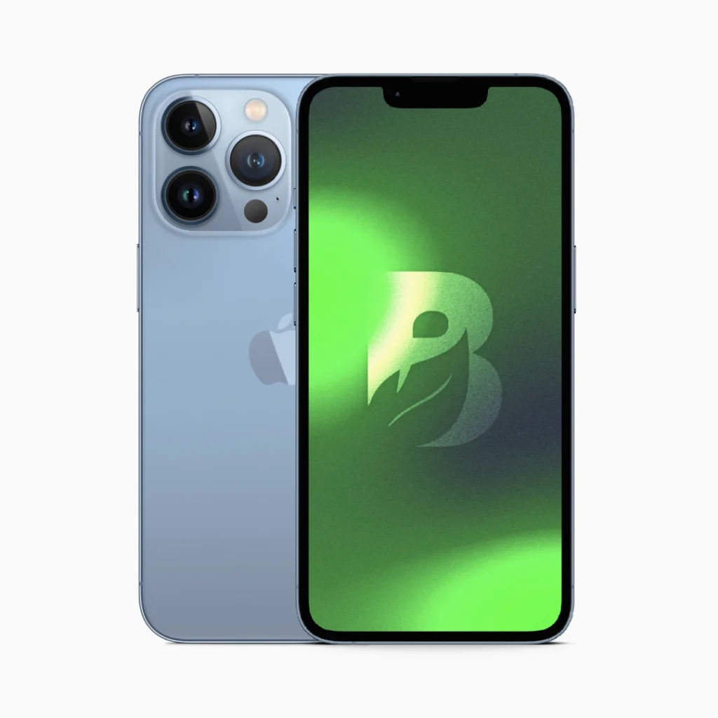
iPhone 13 Pro Max 512GB – Azul Sierra
El precio original era: $1.000.000.$500.000El precio actual es: $500.000.iPhone 13 Pro Max 512GB – Grafito
El precio original era: $1.000.000.$500.000El precio actual es: $500.000.iPhone 13 Pro Max 512GB – Oro
El precio original era: $1.000.000.$500.000El precio actual es: $500.000.iPhone 13 Pro Max 512GB – Plata
El precio original era: $1.000.000.$500.000El precio actual es: $500.000.iPhone 13 Pro Max 512GB – Verde Alpino
El precio original era: $1.000.000.$500.000El precio actual es: $500.000.
Seleccionar opciones
Este producto tiene múltiples variantes. Las opciones se pueden elegir en la página de producto